SWITVOWS

A Switzerland Wedding Planning App
SWITVOWS is a one-stop mobile app that helps international couples efficiently and seamlessly plan their dream weddings in Switzerland by overcoming language barriers, fragmented resources, and lack of transparency.
Role: Sole UX/UI Designer
Duration: November 2024 - February 2025
Tools: Figma, Hand sketch
Introduction
As an Asian expat planning my own wedding in Switzerland, I faced unexpected hurdles—language and cultural barriers, scattered vendor information, and a lack of transparent tools.
Motivated by this experience, I asked:
How might we make Switzerland wedding planning easier, especially for international couples?
The result is SWITVOWS—a centralized mobile app designed to simplify the process. Key features include:
Vendor directories with reviews
Moodboard and timeline tools
Budget calculator
Direct messaging with vendors
SWITVOWS helps couples plan their dream Swiss wedding with clarity and confidence, no matter where they are.
Phase 1: The Research Process
To understand the real challenges of planning a wedding in Switzerland—especially as an international couple—I conducted both secondary and primary research to uncover pain points, needs, and opportunities.
Secondary Research
My goal was to validate the demand and uncover planning challenges in the Swiss wedding market.
Key findings:
Switzerland is a top wedding destination with 36,500 annual weddings—remarkable given its population of 8.9 million.
Common reasons for choosing Switzerland: natural beauty, accessibility, luxury hospitality, and cultural/family ties.
Main challenges:
Limited vendor transparency and accessibility
High costs
Language and cultural barriers
Existing tools are fragmented:
Local planners (tailored but expensive)
Venue packages (easy but generic)
Tourism sites and online directories (limited listings)
Reviews via Google/Instagram (helpful but time-consuming)
Primary Research
To better understand the real challenges of planning a wedding in Switzerland, I conducted interviews with five individuals who were planning—or had recently planned—a Swiss wedding. Finding participants was difficult, so I posted a screening survey on multiple platforms and ultimately identified most interviewees by directly messaging them on Instagram or RedNote based on their tagged wedding photos.
The goal was to validate key pain points, define user needs, and uncover opportunities to improve the planning process for international couples.
I recorded the five interviews conducted via zoom and subsequently conducted the following synthesis and analysis.
Affinity Map
After the interviews, I synthesized notes into an affinity map, categorizing insights into five key areas:
Language barriers
Planning and event-day issues
External tools & vendors used
DIY tools & processes
Selection criteria for venues and vendors
This helped surface consistent user frustrations and recurring behavior patterns.
Empathy Mapping
I synthesized quotes from the affinity map to create an empathy map, in order to better understand users’ thoughts, feelings, words, and actions. Key emotional and cognitive themes emerged, such as:
Anxiety around vendor trust
Stress from juggling work and planning
Excitement to create a unique, memorable experience
This helped humanize the data and stay focused on real user struggles.
JTBD Statement
Job Performer (Who): engaged bride
Jobs (What):
Main Job: plan her own wedding that will be held in Switzerland
Related Job: create a memory with her partner; find the right venue, vendor, and potentially the wedding planner
Emotional Job: feel loved by the surrounding people and the atmosphere
Social Job: socialize with family and friends invited to the wedding
Needs (Why):
ensures that the wedding that will be held in Switzerland will 100% stick to her plan and 100% reflect her vision that she came up during the planning process
minimizes the time and energy it takes her to plan her Switzerland wedding
Circumstances (When/Where):
when she is engaged with her fiance and is looking to have a wedding in Switzerland (while based in anywhere in the world)
Persona
With the information above, I created the below persona, Bridget Miki, who is the idealist bride-to-be. The process of creating a persona has allowed me to visualize my potential user in a more detailed way and I feel that I am one step closer to generating a solution.
Insights from Primary Research
Pain points highlight:
Conflict between work schedule and intense planning process
Highly reliant on local wedding planner
Concerns around exceeding budget
Figure out, articulate, and execute their vision
Needs highlight:
Checklist and timeline
Moodboard with inspirations
Cost cutting tips
Easier communication process
Access to reviews and portfolios
How Might We Questions
With the results from secondary and primary research, I have summarized the how might we questions below:
For brides who want to have their weddings in Switzerland, how might we:
improve the efficiency and effectiveness of their wedding planning process?
help them identify the most suitable vendors and venues for their weddings?
help them stick to their budget?
help them realize their vision for their weddings?
help make sure the weddings will be as perfect and flawless as possible?
The creation of How Might We Question has allowed me to stick to the most important theme of the problems in the next steps and has allowed me to find solutions and build my product around these overarching topics. These questions help me stay focused on the most important things.
Phase 2: Ideation & Solution
With core problems and user needs defined, I moved into the ideation and solution phase—brainstorming, prioritizing, and shaping product ideas into a cohesive user experience. This phase included crafting user stories, generating solution concepts, building user flows, sketching interfaces, and developing a high-fidelity prototype—all centered around solving the real challenges uncovered in research.
User Stories
I translated research into user stories, prioritized by impact, frequency, and feasibility. This helped define a focused MVP around four core needs: planning, budgeting, visualizing, and communicating—forming the foundation for key features and flows.
Solution Idea
Here are some of the key solutions ideas:
Create a single platform that includes direct messaging with all wedding counterparty in any language
Design features to generate wedding day timeline, budget breakdown & monitor, and moodboard with the capability to share them directly through the platform to any counterparty
Include a centralized moodboard that includes posts from various websites or apps
Allow access to summary and reviews of vendors, venues, and wedding planners
Create a community with easy access to wedding tips and past wedding examples
Brand Platform
To define the brand identity of my product, I created SwitVows—a name that blends “Swiss,” “Sweet,” and “Vows” to evoke romance, clarity, and purpose. I crafted a clear mission: to be a one-stop app for engaged brides planning weddings in Switzerland by streamlining vendor discovery, budgeting, and vision execution. The brand personality positions SwitVows as a warm, intelligent digital wedding assistant—reliable, kind, and always helpful—offering guidance and emotional support across language and cultural barriers. Core brand attributes—intelligent, easy, reliable, trustworthy, and kind—reflect the product’s goal: to feel less like a tool, and more like a trusted planning partner.
Heuristic Analysis

To refine my direction, I evaluated three key platforms—The Knot, WeddingWire, and MySwitzerland—using Nielsen Norman heuristics. This process allowed me to learn from the positives and negatives of similar platforms, providing me with inspirations to create my own platform as well as learning from and trying to avoid the mistakes of these existing platforms.
Findings:
The Knot & WeddingWire offer strong features but are US-centric and overwhelming.
MySwitzerland provides limited listings with lack of customization.
None provide localized, centralized, and fully transparent planning experiences for Switzerland-based weddings.
This analysis confirmed a clear gap and opportunity.
Site Map
With key user needs and MVP features defined, I moved on to structuring the app’s information flow—ensuring intuitive navigation and seamless access to core tools. I designed a sitemap to visualize the app's high-level architecture and define all major screens.
User Flows
I mapped out five critical user flows that aligned directly with my MVP priorities and user stories:
Account setup
Venue exploration, venue search and booking
Budget creation and tracking
Wedding day timeline generation
Moodboard creation, inspiration exploration, and linking with external account
Each red route was built to be logical, minimal, and user-centered—eliminating friction for first-time and international users.

Sketches
To begin visualizing the user experience, I translated key user flows into low-fidelity designs—starting with hand-drawn sketches and evolving into wireframes.
I sketched five core flows: account setup, venue search and booking, budget tracking, wedding timeline creation, and moodboard creation. This allowed me to explore layout ideas quickly and prioritize information hierarchy before diving into digital design.
I tested my sketches with five users—gathering early feedback on layout clarity, navigation logic, and key interaction points. Insights from these tests helped me improve structure and eliminate usability friction before wireframing.

Wireframes and Wireflows
I created low-fidelity wireframes in Figma to focus purely on functionality and information architecture, without getting distracted by visual design too early. This process helped me evaluate the logic of each red route—especially for the wedding day timeline—and ensured each flow was complete and user-centered. It also allowed me to identify missing screens, refine task sequences, and prepare a strong foundation for high-fidelity design.
Moodboard
To capture the tone of a Switzerland wedding, I created a moodboard that felt elegant, natural, and romantic. Inspired by my own wedding visuals, I curated references from Pinterest, Dribbble, and Color Hunt to guide the app’s visual direction.

Styleguide
To ensure visual consistency and brand alignment, I built a comprehensive style guide.
Typography: Poppins for headings, Lato for body—clean, modern, and readable.
Color Palette: Swiss red as the primary brand color, paired with white and greys for clarity and warmth.
Iconography: Wedding-themed icons from IconScout, carefully curated for consistency.
Imagery: Real Swiss wedding visuals sourced from my moodboard to reinforce tone.
UI Components: Reusable Figma components (e.g., cards, sliders, tabs) with interactive variants for efficient design and prototyping.
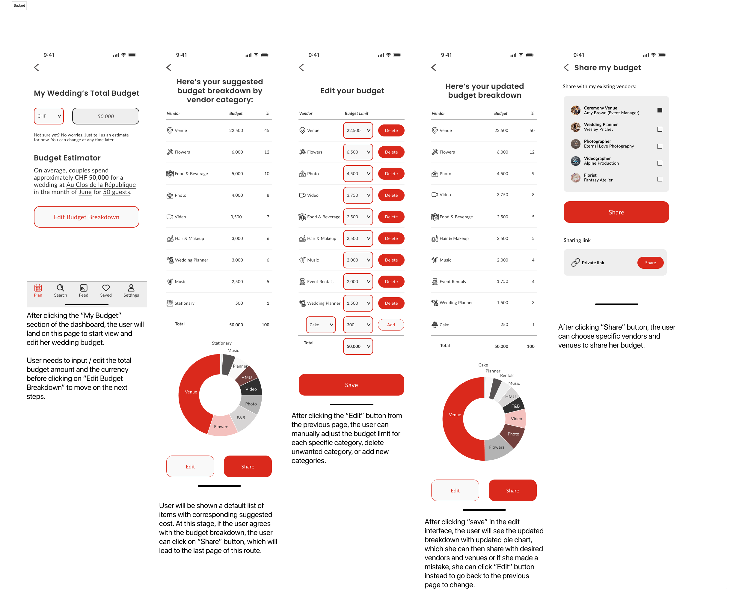
High Fidelity Screens
Using Figma, I brought the app to life by designing high-fidelity screens based on my wireframes and style guide. I followed an 8px grid system and used rulers to ensure consistent spacing, fixed navigation, and aligned UI components across all screens.
Since many screens include dense information, I used generous white space to reduce clutter and improve readability. The Swiss red was used selectively to highlight key actions, while neutral tones maintained a clean, calming interface.
Prototype
Once the high-fidelity screens were complete, I created an interactive prototype in Figma to simulate real user flows and prepare for usability testing. I added clickable interactions and transitions between screens to reflect how users would navigate the app in real life.
I built interactions not only between individual screens, but also within component variants, making the experience more dynamic and responsive. I learned how to streamline the process by applying interactions to groups of screens instead of manually linking each one. I also added micro-interactions like confirmation popups, sticky headers, and fixed primary buttons to enhance usability and make the prototype feel polished and intuitive.
This process helped me identify missing screens, improve flow consistency, and prepare a realistic prototype that reflects the final product experience.
Phase 3: Usability Testing
& Iteration
After building the interactive prototype, I conducted two rounds of usability testing to evaluate the app’s clarity, usability, and overall user experience. Testing with real users allowed me to uncover hidden pain points, gather fresh perspectives, and make targeted design improvements that enhanced both functionality and flow.
Enhancement 1-3
Addition of instruction / tutorial to demonstrate to user how to delete an event when constructing wedding day timeline
Sticky primary button to all pages
Enhanced configuration for head banners and sticky head banners for all pages
Enhancement 4
Addition of confirmation notification (after sharing)
Enhancement 5
Improved flow of adding inspiration post to “my moodboard“
Final Thoughts
As my first complete UI/UX case study, SWITVOWS was a deeply personal and rewarding project that allowed me to apply the full design process—from research and ideation to high-fidelity design and usability testing. Designing a product rooted in my own experience helped me empathize with users on a deeper level and stay grounded in solving real-world challenges.
Throughout this project, I honed my skills in Figma—especially building components, variants, and prototypes efficiently. I also learned the importance of testing early and often: usability testing revealed issues I hadn’t anticipated and gave me valuable insights that directly shaped my design improvements.
If I had more time, I would build out additional high-fidelity screens so that every interaction point is functional. I’d also incorporate user feedback to improve features like animation for notifications, reordering the dashboard based on planning stage, expanding budgeting and timeline customization, and adding more onboarding elements like personalized style questionnaires and local insights.
SWITVOWS reflects not just a product idea, but a journey of turning personal frustration into a thoughtfully designed tool to help others plan their Swiss weddings with confidence and clarity.